Folks, we’ll get back to the analytical content soon, but it’s time to talk about jerseys!
League Pass junkies like myself are often desperate for novelty. Be it weird halftime entertainment acts, funky court designs, or even strange glue-based fan protests, any deviation from the norm is welcome.
That’s why I’m always pumped for the release of the new City Edition uniforms. This year’s bunch, unfortunately, are relatively tepid (particularly compared to last year’s strong class), but there are still standouts. Some are drool-worthy, and some are already being meme’d to death (and one set of duds is inspiring both reactions simultaneously!).
As a reminder, I dress in basketball shorts and a T-shirt 360 days a year, so I’m eminently qualified to pass judgment on these outfits.

The Five Best Uniforms
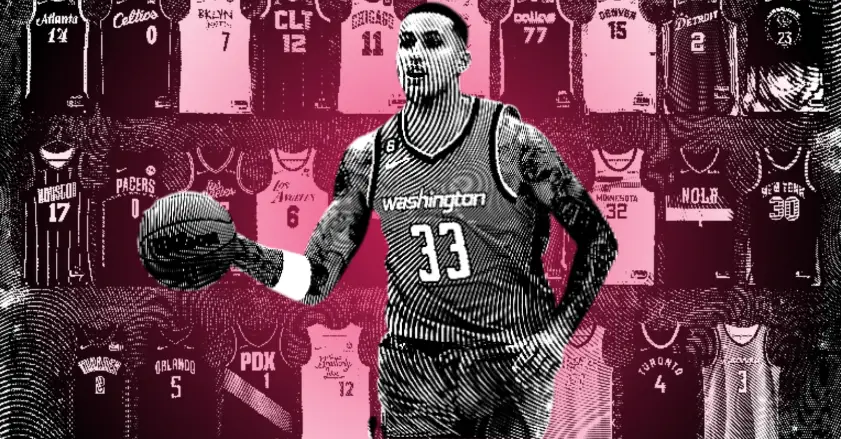
Washington Wizards
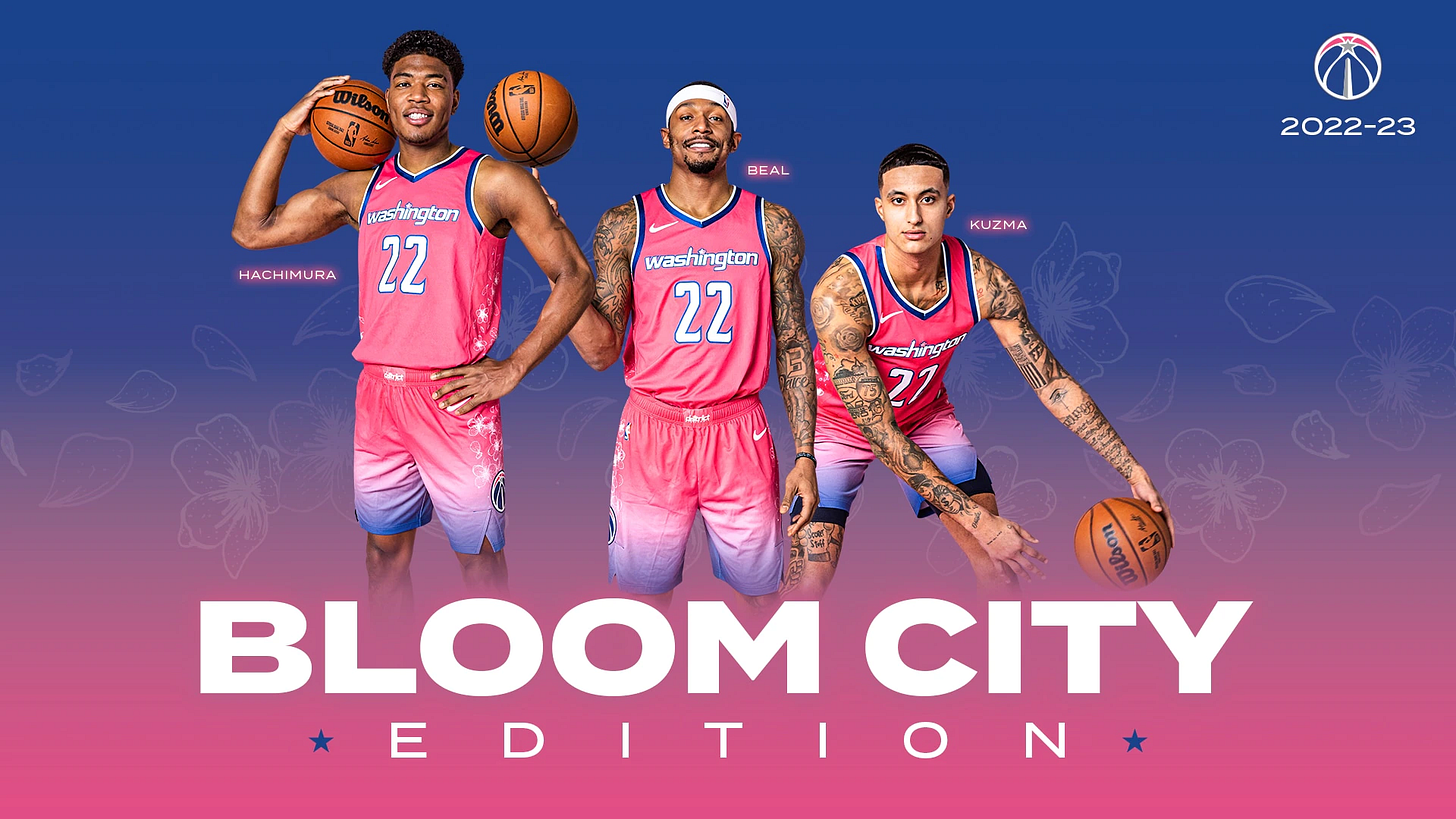
These gorgeous outfits are thematically tied to the Japanese cherry blossoms that famously reside in DC. The Wizards even employ Rui Hachimura, one of just two current Japanese NBA players, so it all comes together perfectly. They are the best alternate uniforms I’ve seen since the original Miami Vice jerseys.
The Wizards debuted these last night, and now the Fighting Cherry Blossoms are undefeated. Coincidence? I think not.
Wife’s take: That’s a lot of flowers. Pretty!
Charlotte Hornets
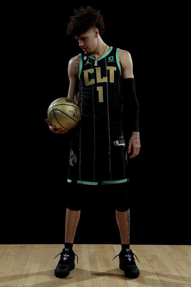
I would’ve chosen a different shortening than the city’s unfortunate airport code, even if this is something the team’s fans have long asked for (??). The internet, as is its wont, is making hay with the new threads.
But don’t let infantile humor distract you from the beautiful design, which features teal-and-gold pinstripes paying homage to the city’s mint and gold rush history. I also love the furious hornet on the shorts — he’s just mad that the team stinks, I guess. Despite the team’s relentless losing, these units are a winner.
Wife’s take: Oh, those are my favorite. For sure. Beautiful. Wish they hadn’t picked that specific combination of letters.
Houston Rockets
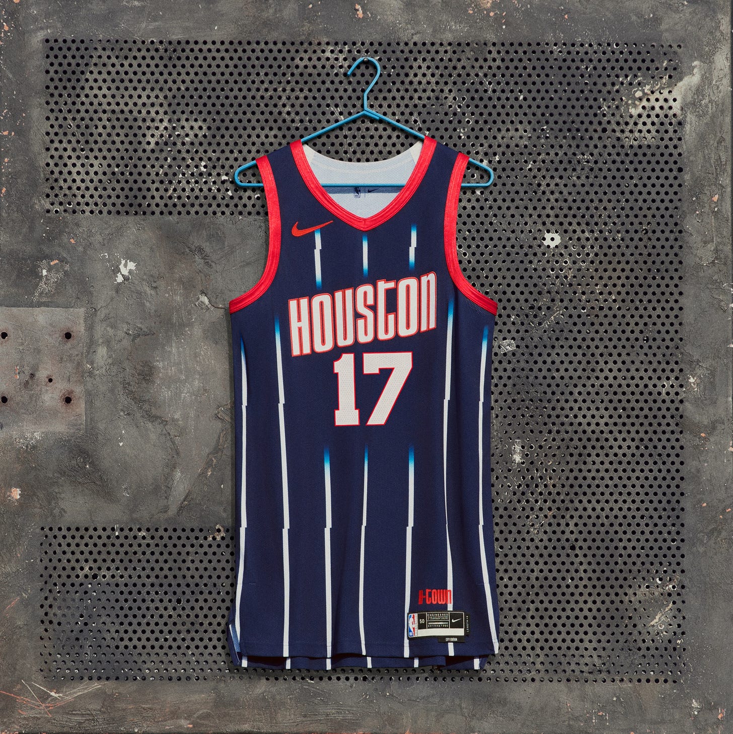
Nice colors are remixed with the classic angled lettering from the ’94-’95 Rockets title teams and the fan-favorite pinstripes. These are instantly recognizable as being definitively Houston.
Bold but not too busy, the white pinstripes are supposed to resemble rockets in flight. I’m not usually a fan of throwbacks, but these work for me (although I wish they’d tweaked something from last year’s design). The wife did not agree.
Wife’s take: These are terrible. Why are the pinstripes jagged? It looks like a graphic design error. Throwbacks are stupid.
Phoenix Suns
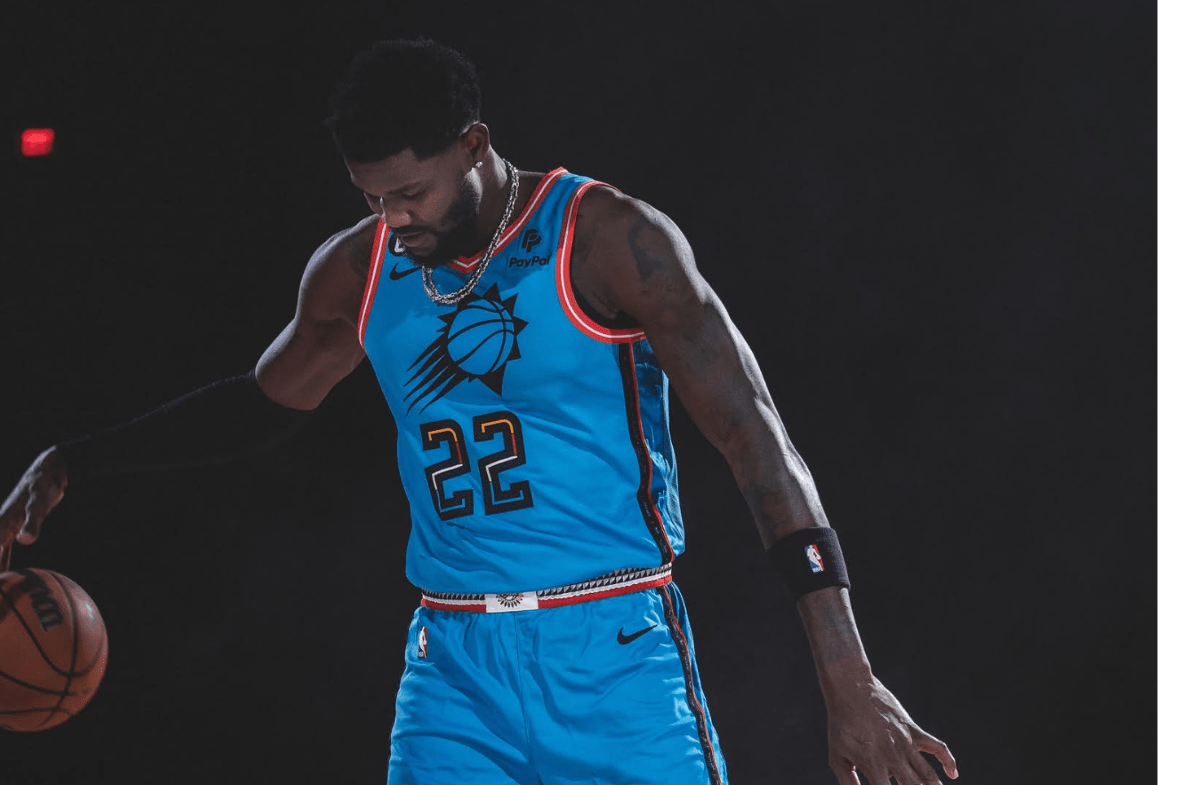
The Suns went turquoise to honor Arizona’s 22 indigenous tribes. The varied colors in the numbers are a nice touch, as are the belt designs. These are a breath of fresh air after last year’s brick-breaker monstrosities (that everyone except me loved).
These jerseys have intricate details everywhere you look. I’m also a fan of turquoise (*ducks brick thrown at head*), which you can blame on me growing up in the 90s.
Wife’s take: These are cool. I like them. I could do without the basketball-sun-thingy. (*Me: “You mean the Suns’ logo?”*) Yeah, I don’t like that. Too busy. But the rest is a good look.
Atlanta Hawks

These are chill and classy. Peach is an underutilized sports accent color, and they’re using it sparingly here. The font is pleasing to my eye.
Hilariously, the official description says the colors are “electro peach,” “sunset haze,” and “infinity black,” which is incredible marketing-speak. I also adore the accompanying court, with its cute little peach basketball (the shorts feature the same logo on the buckle).
Atlanta’s uniforms have been all over the place in recent years, to varying results, but I really like these understated get-ups.
Wife’s take: These look like they are honoring the Roaring ‘20s. Classy. Is it a 100-year anniversary? (*Explains there was no NBA in the 1920s and the team that became the Hawks got its start in 1946.*) Oh. Well, they’re still nice.
Honorable Mentions: San Antonio, Boston
The Five Worst Uniforms
Los Angeles Lakers

Los Angeles can’t get anything right this year. We’ve seen variations of these unis before, and they weren’t perfect then. Part of the problem is that the Lakers’ everyday purple-and-gold ensembles are arguably the league’s best. It’s hard to come up with an alternate that could beat those, but it would be nice to see the fine folks at Nike at least try.
ESPN’s Nick DePaula says that these uniforms are “intentionally stripped back” to show “how to transform a blank page into a world of possibility.” If you’re reading between the lines, it means FIRE SALE AT THE TRADE DEADLINE! It’s never good when the marketing-speak feels like an ominous portent for the team’s future.
Wife’s take: These are boring. Next.
Utah Jazz
No, I didn’t forget something. There’s no jersey pic because there are no jerseys. Utah inexplicably decided to opt out and be the only team in the league to not have a city edition this year. It’s a bummer, because they’ve had some gems in the past. Instead, they wanted to wear these yellow and black practice pennies.
Somehow, these phantoms aren’t the worst jerseys in the league.
Wife’s take: (*Me: Points at air.*) I don’t get it. Where are the jerseys? (*Me: There are none this year.*) That’s dumb, and you’re dumb. (*Me: Fair!*)
Sacramento Kings
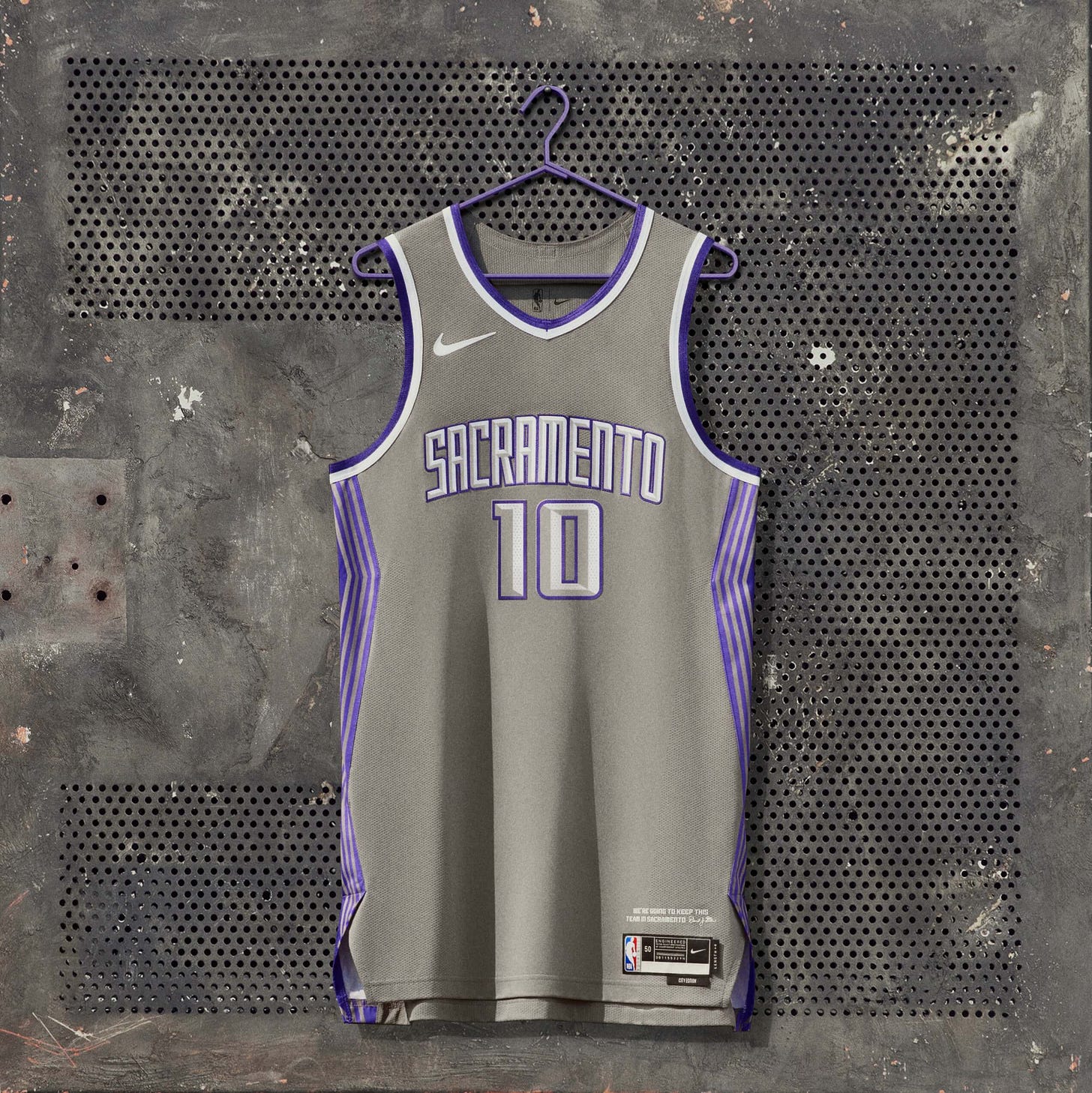
I never understand when teams make their jerseys as dull as possible. The reasoning is even worse: the team was inspired by, uh, tin, the metal associated with ten-year anniversaries. The Kings are trying to celebrate the tenth anniversary of the “fight to keep the Kings in Sacramento,” which is both a demonstrably untrue timeline (as Paul Lukas details in his hilarious piece) and also kind of a downer.
Wife’s take: HATE THEM. Grey and purple are gross together. Tin is the worst silver-colored metal.
Portland Trail Blazers

Why is Damian Lillard wearing a long-sleeve T-shirt under his jersey? That’s such a dad move.
I normally like teal, but then I discovered these uniforms’ hide a horrible secret.
From a local newspaper:
The Portland Trail Blazers have revealed their 2022-23 Nike NBA City Edition uniform — and it features a design that was once all too familiar for visitors of the Portland International Airport…
The same pattern [on the teal slash] was seen on the Portland International Airport’s iconic carpet before it was removed in 2015.
They’re inspired by the airport’s carpeting. And not even the current carpeting, but carpeting they tore out years ago! I can’t look at these the same way anymore.
Portland is a hipster city with loads of exciting things to do and places to go… I always assumed. But this makes me think Portland is a desolate wasteland of non-culture where the local yokels pine after the thing they used to step on as they fled the city for better ports. Get it together, Portland/Nike!
I promise you there is no such thing as iconic airport carpet. I didn’t think we could do worse than being inspired by tin, but here we are.
Wife’s take: I really like these! Airport carpet is an interesting choice, but maybe it reminds them of the happiness of coming home!
Golden State Warriors
Let’s do a quick scan of what Golden State has!
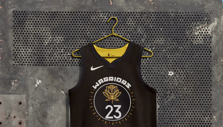
Nice! The jersey is supposed to represent the Bay Area’s “Warrior Women,” which is a cool idea — the yellow flower symbolizes the women’s suffrage movement. That is a significantly better starting place than tuna-can metal or commercial concrete-cloth. The Warriors often have a big circle on the front of their shirts, and it’s become recognizable iconography for the franchise. Let’s see what else the jerse—AHHH WHAT IS THIS:
This looks like a cheap screen-printed tank you can snag at any tourist-trap store in Panama City Beach in a buy-one-get-three-free sale. It’s horrible. If you want to see flowers done correctly on a jersey, go back up to the Washington section, and try to rid your memory of these. This is TOO MUCH FLOWER.
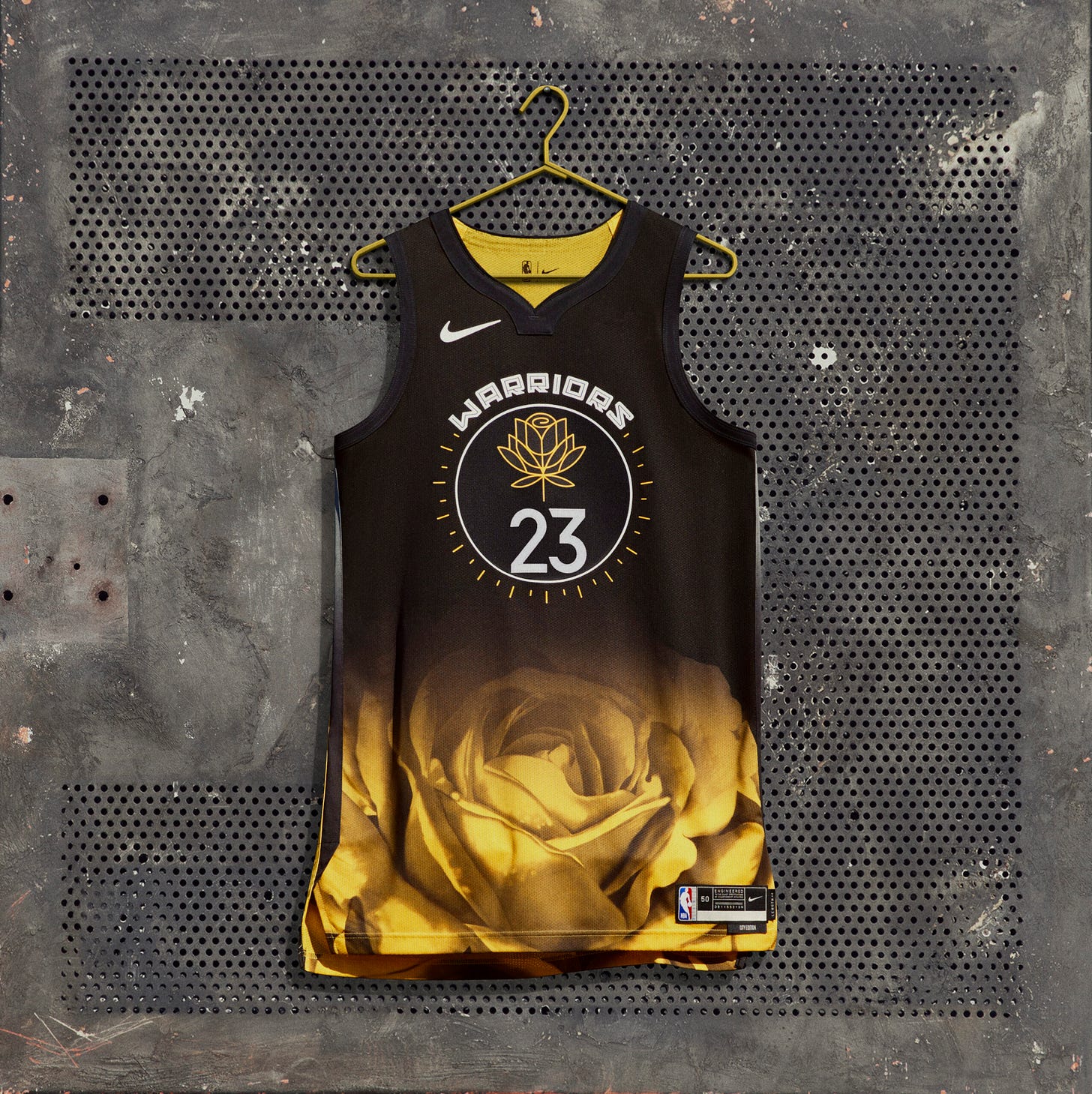
Zach Lowe had a piece about the design behind these, and it’s a lovely story. But having a great cause does not mean that we have to give a pass to these atrocities. Especially since the Warriors almost went with these incredible alternates:
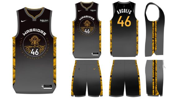
Those are so, so much better. The gold-wire rose (meant to evoke the Golden Gate bridge) is legitimately cool, and the giant yellow flower looks way better as a side panel. The gray at the bottom symbolizes San Francisco fog, which is also neat.
We could’ve had classics, but alas. If nothing else, the giant rose is undoubtedly unique. As I said in the beginning, I usually appreciate novelty for novelty’s sake — I should’ve been careful what I wished for…
(I can already feel these growing on me and no doubt I’ll love them when I see them live.)
Wife’s take: They ****** up.
Michael Shearer
Michael Shearer is an NBA obsessive who writes to answer the questions he has about the league. You can follow him @bballispoetry. He also is a contributing writer for Fansided at Hoops Habit and writes a free NBA analytical newsletter at basketballpoetry.com that goes out every Tuesday and Friday.